Blog
Creating great mobile onsite search experiences
by Klevu on
Lots of resource goes into designing onsite search for desktop; ensuring the search bar is prominent, large, and available on all page templates. But can the same be said for onsite search on mobile? In this blog post we will look at some of the best practices when designing mobile onsite search to ensure a great search experience on any device.
Ensure search is displayed prominently in the navigation menu bar at all times
Some UX designers remove search entirely from the main mobile menu bar, making it only accessible when a user selects the burger bar. This isn’t ideal because users who search are far more likely to convert than those who don’t, so it makes sense to make search functionality as accessible as possible on mobile.
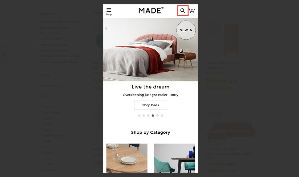
In this Made.com example, the full search bar from desktop is condensed so that the magnifying glass icon is retained. There wouldn’t be room to keep the full search bar on the same level (next to Made’s logo) on mobile, so this is a good compromise, and using the same icon provides consistency.
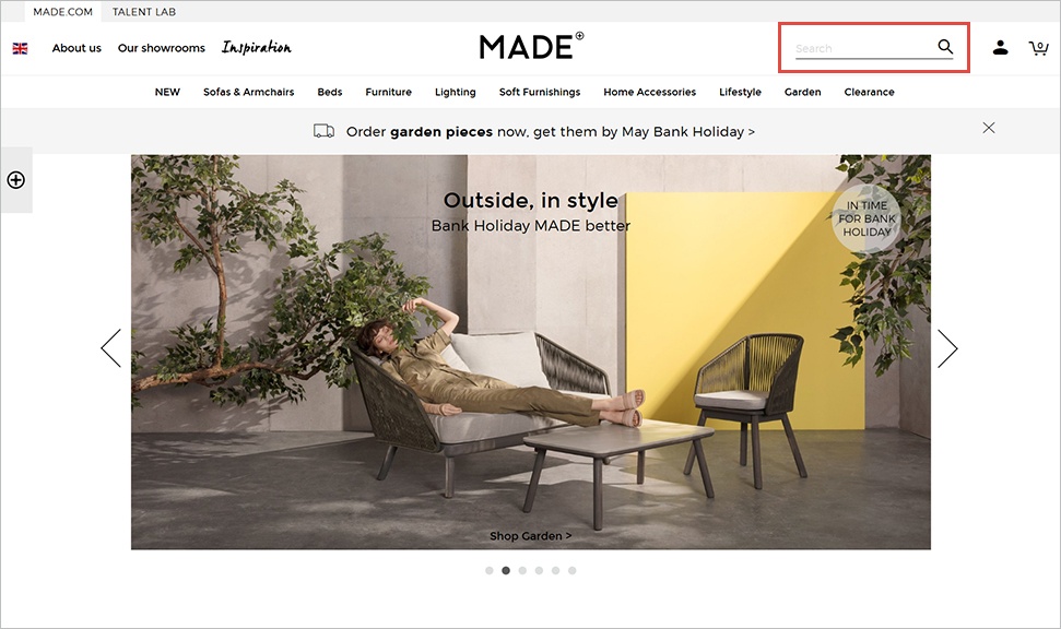
BHS.com goes one step further. The search bar on desktop is very impactful because it’s full-bleed and large:

There’s room for this because it’s not limited by the number of categories in the menu bar, as it’s the next level down. The search experience in mobile is similarly impactful; as on desktop, the search bar isn’t limited by space because it’s the level down from the burger bar and basket icon. This means it can again afford to be full-screen, and can therefore retain the search bar with the ‘Search’ microtext inside it.
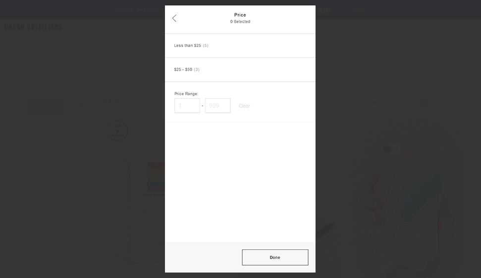
Price bands rather than slider
Price sliders work well on desktop; users can easily slide their min and max price thresholds precisely with a mouse or touchpad. However, this is much trickier on smaller mobile devices. This is because most mobile users hold their phones in one hand, making it difficult to tap and drag with just the one hand.
Urban Outfitters’ UX designers have taken this into account and used price bands, whilst giving the user the option to key in exact thresholds too:
Instant search
Instant search is just as useful on mobile as it is on desktop, yet some retailers decide to deactivate it for mobile users.
Providing that the instant search dropdown box allows for space around it, so that users can scroll past it or view the page behind it, then it makes sense to keep it activated for all users, regardless of device.
Here’s a good example of instant search on Skandium:
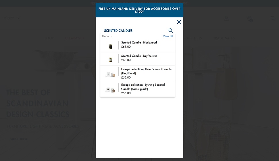
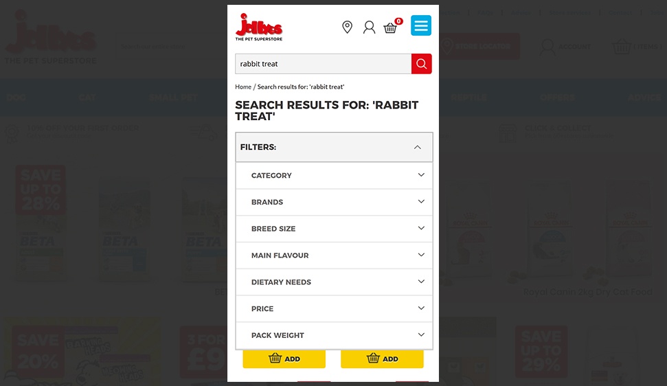
Retain multi-option filters
Similarly to instant search, often the highly useful filters that are present on onsite search results pages when viewed from a desktop disappear from mobile search results pages.
Allowing mobile users to refine their search results based on colour, category or custom attributes is a sensible way to ensure that users are receiving the most relevant results possible, so we’d always recommend retaining filter options for all devices.
Here’s a great example of custom attributes in action on Jolleyes, an online pet shop:
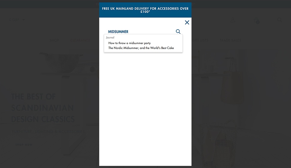
Content results
Klevu can index CMS pages on eCommerce sites too, meaning, as well as serving product and category results, it can also serve content pages, for instance blog posts or FAQs, in a separate tab.
If you have this enabled for your desktop search, then you can also serve content results on mobile.
Here’s a great example from Skandium where a user is looking for midsummer party inspiration:
To conclude, mobile onsite search should be as optimised as desktop search, especially considering mobile traffic often converts at a lower rate than desktop traffic. If your search bar on mobile is hard to find, consider testing surfacing it, either just using a search icon, which expands to a full bar when selected, or displaying the full search bar. Either way, search should be accessible at a glance from all page templates, and not hidden away behind the burger bar. It’s worth getting your web designers onboard with the importance of onsite search from the get-go so that it’s always considered in redesigns.
If instant search, multi-option filters and content search are used on your desktop site (which we hope they are!), then do ensure they’re used on mobile too. Price bands and input boxes on mobile are a great adaption to the price sliders that can often be found on desktop search, and are much more thumb-friendly.
Related articles

Getting Personal With It: The Importance of Personalization in E-commerce
Your company might have an existing personalization strategy in place, or perhaps you’re wanting to change tactics. We uncover insights into the benefits of having a personalization strategy and the…

How to Attract Customers of the Future
Shopping habits are changing. Today’s consumers are developing expectations that will shape the future of e-commerce. Brands that cater to these growing demands will flourish, while others will fall behind.